I have my hands in a lot of stuff, so let me give you the tour.

STEP 1: Intro
Hi, I am Chris Zukowski.
I am a game marketing consultant and strategist. I have helped Games-as-a-Service companies, indie publishers, and small to single-person teams understand their audience and communicate with them in a more personal way. I specialize in optimizing your marketing for the Steam algorithm, creating fantastic Steam pages that sell themselves and setting up Email marketing campaigns that your fans will look forward to opening.
I also love teaching people and think everyone should have a shot at making games. I want to help studios who are confused, frustrated, or just totally ambivalent to the process of marketing their wonderful games. I believe that marketing, if done correctly and confidently, can be just as fun as making your games.
As seen in


STEP 2: Get your free stuff
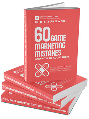
Sign up for my newsletter to get weekly marketing tips. As a special thank you for signing up, I will send you a copy of my ebook about the most common marketing mistakes indies make.
STEP 3: Learn
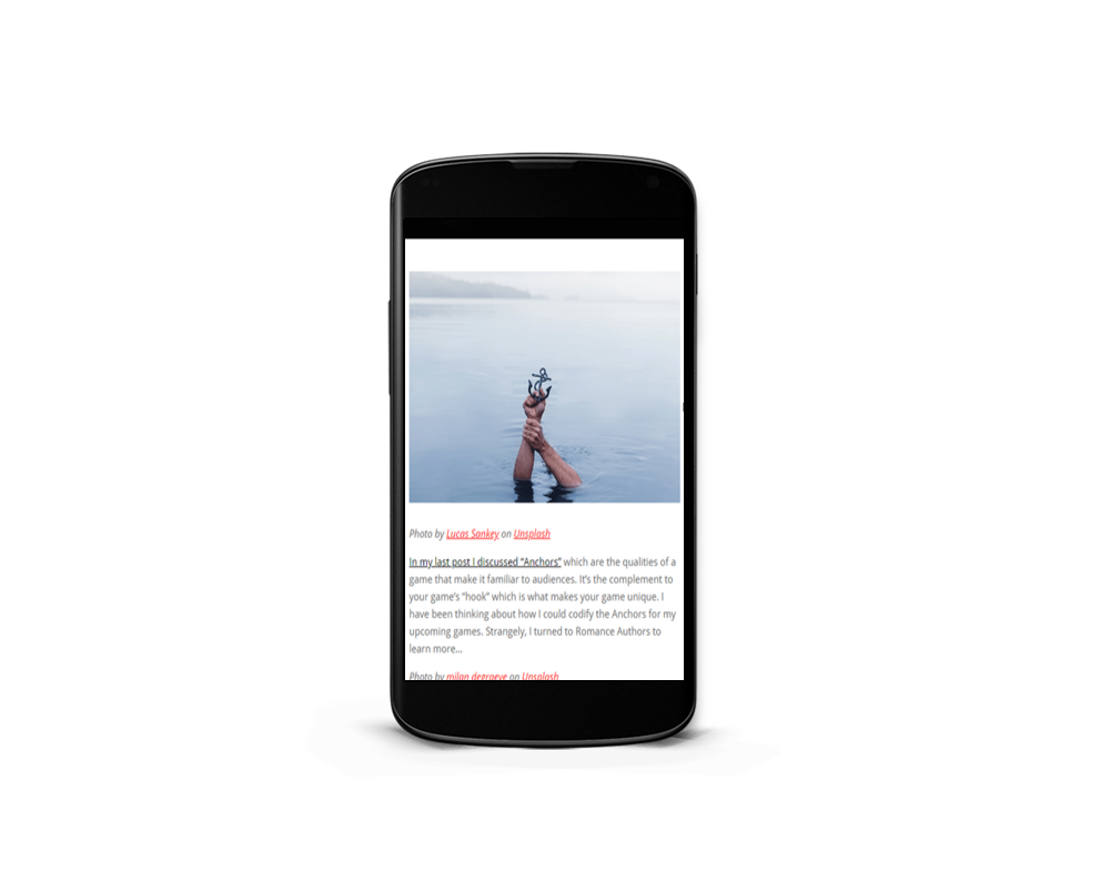
I have written thousands of words on marketing your game.
You can find all of my blog posts on this page.
But if that feels like you jumping into the deep end, start here with my favorite starter posts.
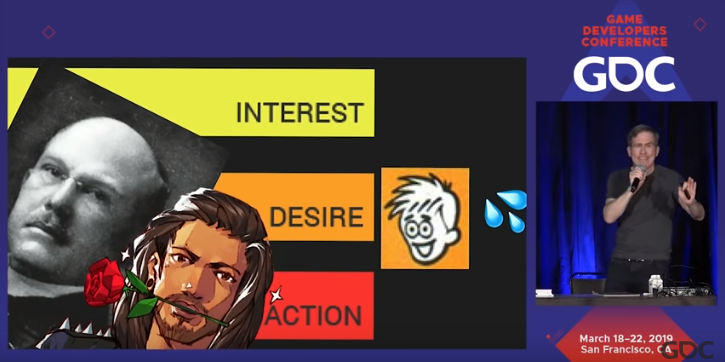
STEP 4: Watch my talks
I write a TON about how to market your game but it can be a bit… dry. To really understand my voice, how passionate I am, and how fun this can be, watch my various talks and podcast appearances.
STEP 5: Join
Nobody has all the answers. We are all learning together. So, join my community where you can talk to me and other folks who are all going through the same stuff to try and get our games made and played. Check out my Discord and Follow me on twitter

STEP 6: Get help
I have been so fortunate to have the opportunity to help some big studios find their marketing voice. I provide comprehensive courses to teach you how the pros do it.
If you have a very specific need for your marketing or you would like to have some more personalized mentoring, I do offer 1-on-1 consulting services.
Compass Photo by Jamie Street on Unsplash